Scandinavian Interior Design Guide: Palette, Wood, Rooms
AI Flip Room · 9 min read
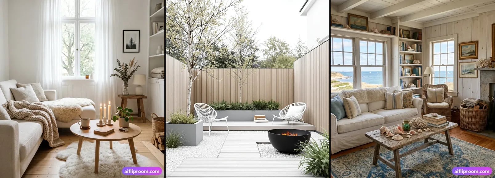
Walk into a well-designed Scandinavian room and the first thing you feel is relief. The clutter is gone. Light pools across pale floors. A wool throw waits on a simple chair. Nothing shouts, yet everything feels considered. That quiet confidence is why Scandinavian interior design has stayed popular for the better part of a century, and why it translates so well to modern homes, rentals and real-estate listings alike.
This guide covers what actually defines the style, the palette and materials that make it work, how it differs from its close cousins, how it changes from room to room, and the mistakes that turn calm into cold. If you would rather look than read, the Scandinavian page in our style library shows the look in detail, with pages for individual rooms.
What defines Scandinavian interior design?
Scandinavian interior design is a light-first, function-first way of furnishing a home that grew out of the Nordic countries in the twentieth century. Pale walls and floors make the most of thin winter daylight; blond wood, wool and linen keep the room warm; and every object earns its place. Minimal, but never sterile.
The style took shape across Denmark, Sweden, Norway, Finland and Iceland in the early and mid twentieth century, and two forces shaped it. First, the climate: long, dark winters made bright, light-reflecting interiors a practical necessity rather than a preference. Second, a democratic design philosophy: the belief that beautiful, functional objects should be affordable to ordinary people, not reserved for the wealthy.
That thinking produced designers the world still copies: the bent plywood of Alvar Aalto, the moulded chairs of Arne Jacobsen, the joinery of Hans Wegner. Their work shared honest materials, human scale and no ornament that did not earn its place. The style has softened and warmed since, but those roots still explain every choice below.
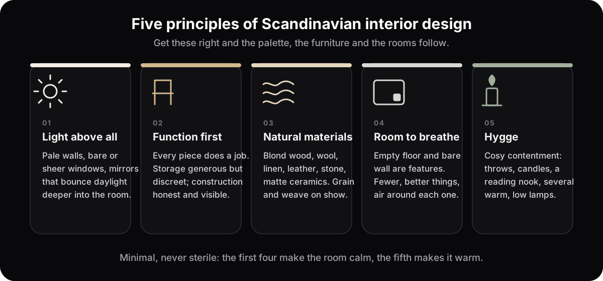
Light above all. In a region with so little winter daylight, brightness became the organising principle: pale walls, unobstructed windows, mirrors placed to bounce light deeper into the room, and sheer or absent window coverings. The room is built to make the most of whatever daylight it gets.
Function first. Every object should do a job and do it well. Storage is generous but discreet, and furniture is honest about how it is made. A purely decorative piece is chosen with real intention, not to fill a gap.
Natural materials, especially wood. Light-toned woods appear on floors, furniture legs and shelving, and they are what keep the pale palette from feeling cold. Wool, linen, leather and stone round out the material story.
Room to breathe. Negative space is a feature, not a failure. Empty floor, bare wall and a little air around each object are what let the eye rest. Restraint is the point.
Hygge. The Danish idea of hygge, roughly cosy contentment, is the emotional core of the style and the reason a spare room still feels inviting: soft textiles, candlelight, a reading nook, several warm low lamps rather than one bright ceiling light.
Which colours and materials?
A warm white or soft grey base, blond wood as the main warm accent, and colour in small, dusty doses: sage, dusty blue, blush, charcoal. Black appears only as a thin line, a frame, a lamp, a chair leg. Texture does the work colour would do elsewhere: wool, linen, sheepskin, oiled wood, matte ceramics.
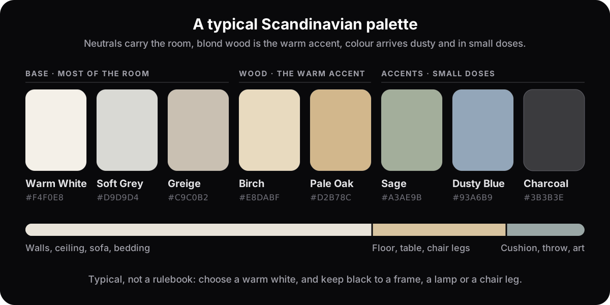
The classic base is white and off-white, but rarely a harsh, clinical white. Under warm lamplight a blue-white turns grey, so pick one with a little warmth in it. Layer soft greys, pale beige and greige over that base, and let the wood bring the warmth: birch, ash, beech and pale oak on floors, table tops, chair legs and shelving, finished matte or oiled rather than glossy.
From there, colour comes in quietly. Muted, dusty hues such as sage green, soft blush, dusty blue and charcoal appear in small doses through a cushion, a throw, a single piece of furniture. The current take leans a touch warmer and moodier than the crisp white interiors of a decade ago, but the logic is unchanged: a calm neutral base with restrained accents.
Because the palette is so quiet, texture does the heavy lifting. A room of all-smooth surfaces reads flat and cold; layering tactile materials makes the space feel rich even when the colours stay muted. Reach for:
- Wood on floors, dining tables, stools and open shelves.
- Wool and sheepskin as throws, rugs and a fleece over a chair for instant hygge.
- Linen and cotton in relaxed, slightly rumpled bedding and curtains.
- Rattan, cane and jute in baskets and light pendants that add pattern without colour.
- Matte ceramics and stoneware: handmade mugs, vases, planters.
- Greenery: a few real plants to keep the neutral scheme alive.
How is it different from Japandi and minimalism?
Scandinavian keeps comfort where minimalism removes it: throws, rugs, plants, a few personal objects stay. Japandi takes the same pale-wood restraint and grounds it with darker Japanese tones, lower furniture and more stillness. Coastal borrows the light palette but warms it with sea blues, rattan and a looser, holiday mood.
The four share a lot of DNA, which is exactly why people mix them up. The table sorts them by the things you can actually see in a room.
| Scandinavian | Japandi | Minimalist | Coastal | |
|---|---|---|---|---|
| Palette | Warm white, soft grey, dusty accents | Warm neutrals with charcoal, clay and black | White, grey, concrete; almost no accent | White, sand, sea blues and greens |
| Wood tone | Blond: birch, ash, pale oak | Pale to dark, often paired: oak, ash, walnut | Little wood, or a single pale species | Pale, weathered or whitewashed |
| Texture | Wool, sheepskin, linen, knit | Linen, paper, raw ceramics, woven mats | Smooth: plaster, glass, stone | Jute, rattan, cotton stripes, driftwood |
| Mood | Bright, cosy, everyday | Still, grounded, contemplative | Silent, architectural | Relaxed, breezy, on holiday |
| Best rooms | Living rooms, bedrooms, small or dark rooms | Bedrooms, home offices, bathrooms | Open-plan rooms with good architecture | Sunny living rooms, sunrooms, bedrooms |
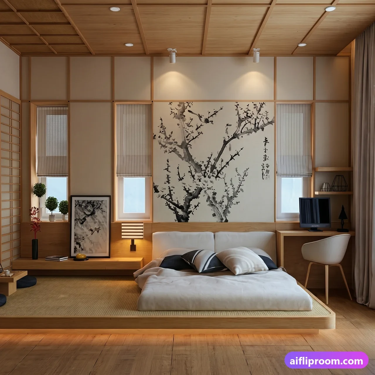
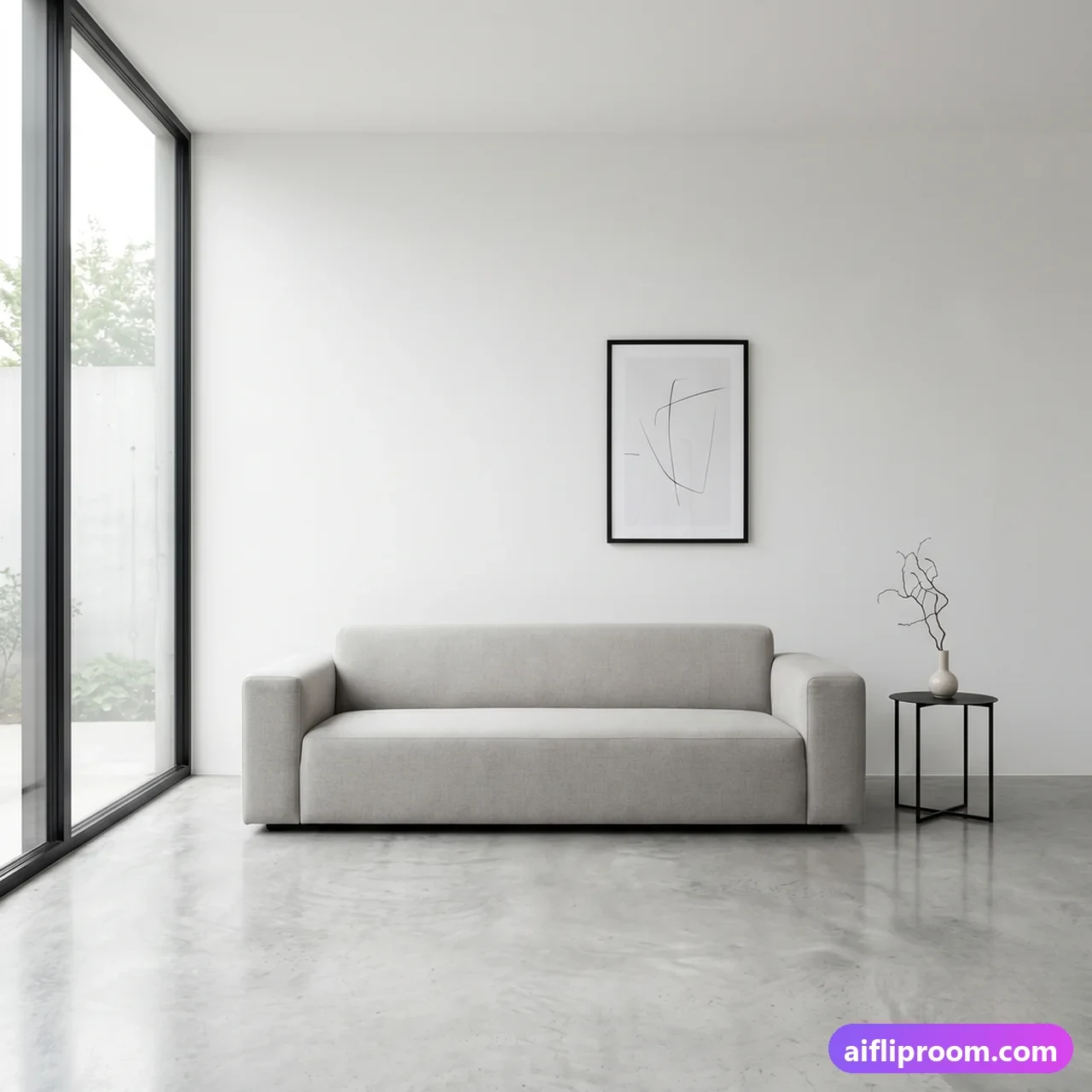
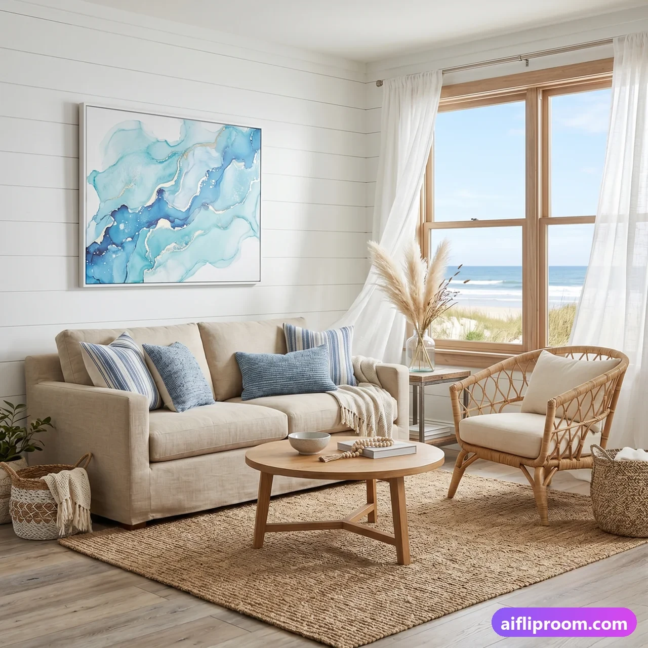
If the moodier cousin appeals, the Japandi style guide covers its palette and rooms in the same depth as this one; the Minimalist and Coastal pages in the style library do the same for the other two.
How does it change room by room?
The principles stay the same; what changes is where the light and the softness go. A living room gets a low sofa on legs, a wool rug and several lamps; a bedroom gets layered linen and bare windows; a kitchen gets flat pale fronts and clear counters; a bathroom gets white tile warmed by timber.
Living room
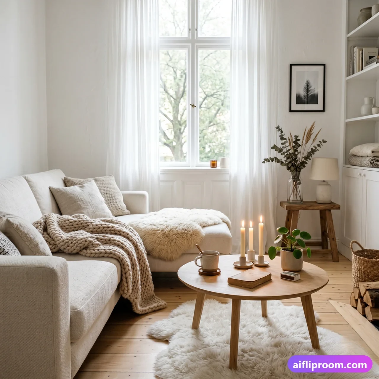
Anchor the room with a low, comfortable sofa in a light neutral, raised on visible legs so the floor shows underneath, then layer a wool rug, a couple of textured cushions and a single pale-wood coffee table. Keep the walls mostly clear: one or two framed prints or a simple shelf is plenty. Leave a real gap of floor around the furniture so the space feels open, and light it with two or three warm lamps rather than one bright ceiling fixture. The Scandinavian living room page goes into the details.
Bedroom
The Scandinavian bedroom is a study in calm: layered linen and cotton bedding in white and oatmeal, a pale-wood or upholstered headboard, small light bedside tables with simple lamps. Skip the heavy drapes; go sheer or bare to let the morning in. One plant, one candle, a stack of books, and stop there. There is more on the Scandinavian bedroom page.
Kitchen and dining
Flat, handle-less fronts in white or pale wood, a simple worktop, and open shelving for a few ceramics that actually get used. Pair a light-wood dining table with slim-legged chairs that need not match, and hang one pendant lower than feels natural over the table; that low light is what makes the space feel intimate. Keep the counters almost clear. The Scandinavian kitchen page covers fronts, worktops and lighting.
Bathroom and entryway
Even the smaller rooms follow the rules: white tile, pale timber, matte black or brushed steel fittings, a woven basket for towels and one plant that tolerates humidity. An entryway wants a simple bench, wall hooks and a mirror to bounce light deeper into the home.
What are the common mistakes?
Five, and they all come from copying the surface without the warmth: an all-white room with no textiles, a whole showroom set from one range, too many objects, a single bright overhead light, and heavy curtains that undo the entire premise. Fix the textiles and the lighting first; the rest follows.
- Cold instead of cosy. All-white with hard surfaces and no textiles reads like a waiting room. Layer wool, linen and wood to bring the warmth back; the textiles are half the style, not an extra.
- Matching flat-pack overload. One entire showroom set flattens the look. The style came out of craftsmanship, and one solid wood piece or one vintage chair among the affordable items is what stops it looking like a catalogue.
- Too much stuff. The negative space is the design. When in doubt, remove something.
- One bright ceiling light. A single overhead fixture flattens everything it touches. Use several warm, lower sources instead.
- Heavy curtains and blue-white walls. Thick drapes block the daylight the whole style is built around, and a stark blue-white goes grey under warm lamps. Go sheer or bare at the window, and pick a white with a little warmth in it.
How do you try it on your own room?
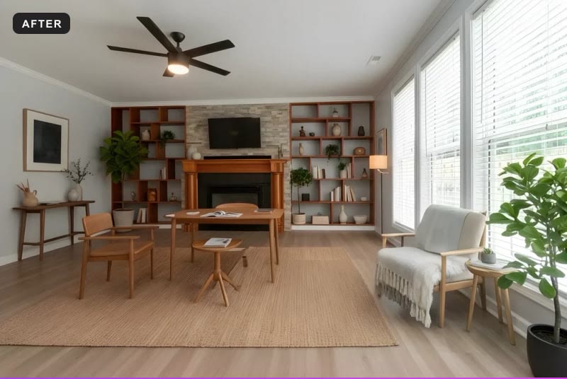
Take one level, daylit photo of the room, upload it, choose Scandinavian, and look at the result standing where you took the picture. The render keeps your walls, windows, ceiling and camera angle and changes only the furnishings, so you are judging the style in your own light before buying anything.
You can build the style gradually: a warm neutral wall colour first, then one pale-wood piece, then textiles until the room feels alive. But the fastest way to know whether Scandinavian suits your space is to see your actual room in it. That is what AI Flip Room is for: upload a photo of the room as it is, choose Scandinavian, and the tool restages it in 15–60 seconds, depending on how much detail the room has. Every account starts with three free renders and no card, which is enough to run one room in Scandinavian and two of its cousins before you decide. Our guide to seeing your room before you renovate explains what a preview like that settles and what it does not.
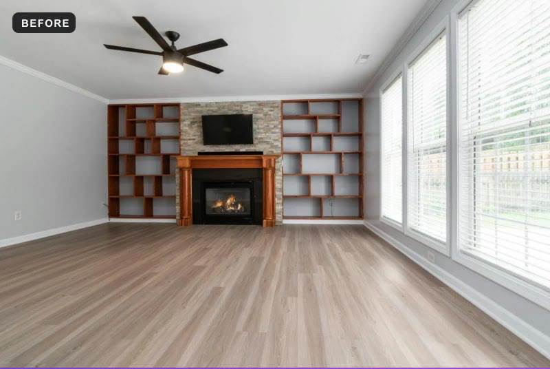
If the photos might go into a listing, one honesty note: a restaged image must be labelled as such and must not change the property itself. Furnishings yes; walls, windows and fixtures no. Our guide to disclosure rules has the wording for the markets we have read in full.
Whichever room you start with, the lesson of Scandinavian interior design holds: choose fewer, better things, let light and natural materials lead, and leave enough room for the space, and the people in it, to breathe.
Questions people ask about Scandinavian interiors
What is the difference between Scandinavian and Japandi?+
Japandi is Scandinavian warmth crossed with Japanese restraint. Both use pale wood, natural textiles and uncluttered rooms, but Japandi sits lower to the floor, adds darker tones such as charcoal, clay and walnut, and prefers stillness to cosiness. A Scandinavian room invites you to curl up with a throw; a Japandi room invites you to sit quietly. If your room is small and dark, Scandinavian usually wins; if it is large and calm, Japandi can feel more resolved.
Does Scandinavian design work in a dark or north-facing room?+
It is arguably the style designed for exactly that problem. Pale walls and floors, a mirror facing the window, light furniture on visible legs and several warm lamps instead of one overhead all pull a dark room upward. What will not work is a stark blue-white paint, which turns grey when the light is thin; choose a white with a little warmth in it and let the wood and textiles do the rest.
Which woods are used in Scandinavian interiors?+
Pale species, finished matte or oiled rather than varnished: birch, ash and light oak most often, beech in older pieces, and pine in the more rustic versions. The finish matters as much as the species. A glossy lacquer on the right wood still looks wrong, because the style wants to see the grain, not a reflection. If your floor is dark, a large pale rug does most of the same work.
Is Scandinavian style a good choice for staging a home for sale?+
It is one of the safest choices. It makes rooms photograph brighter and larger, it suits almost every kind of property from a city apartment to a family house, and very few buyers dislike it. It is especially useful for small or north-facing rooms. Keep the staging to furniture, rugs, textiles and plants, label the photo as virtually staged, and leave the walls, windows and fixtures exactly as they were shot.
See it on your own room
Upload a photo and watch AI restage your space in 15–60 seconds, depending on how much detail it has — free to try, no credit card.
Try AI Flip Room freeGot a question about this?
Something unclear or not covered? Ask here. We read every question and answer the useful ones right in the article. Nothing you write is published.
Related reading
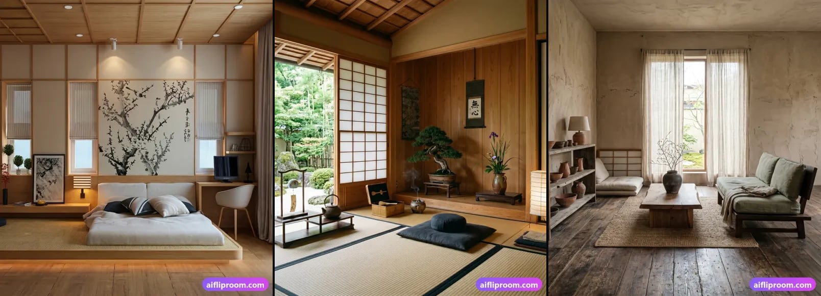
Japandi Style Guide: Palette, Materials, Furniture, Rooms
What Japandi is, the palette and materials that make it read as real, the furniture that works, how it changes room by room, and the mistakes to avoid.
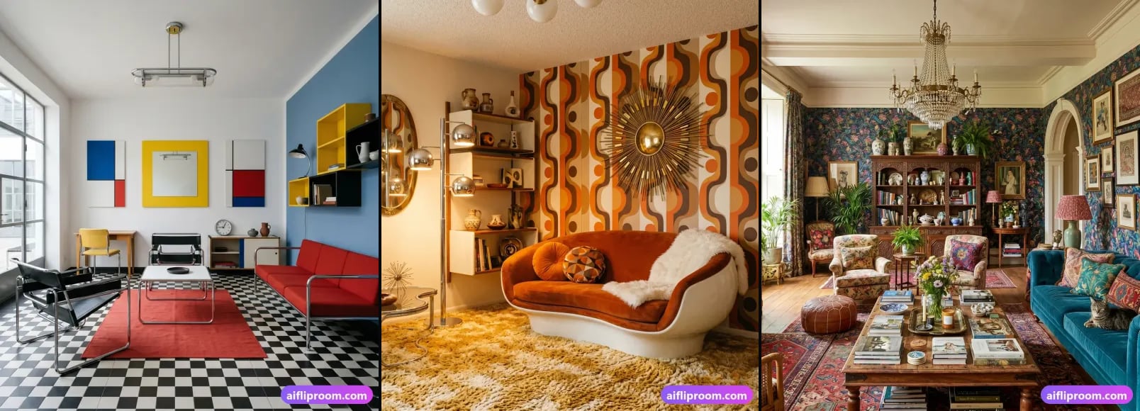
See Your Own Room in a New Style Before You Buy Anything
Preview your actual room in a new style before buying furniture or hiring anyone: what a preview settles, what it can't, and five steps to a useful one.
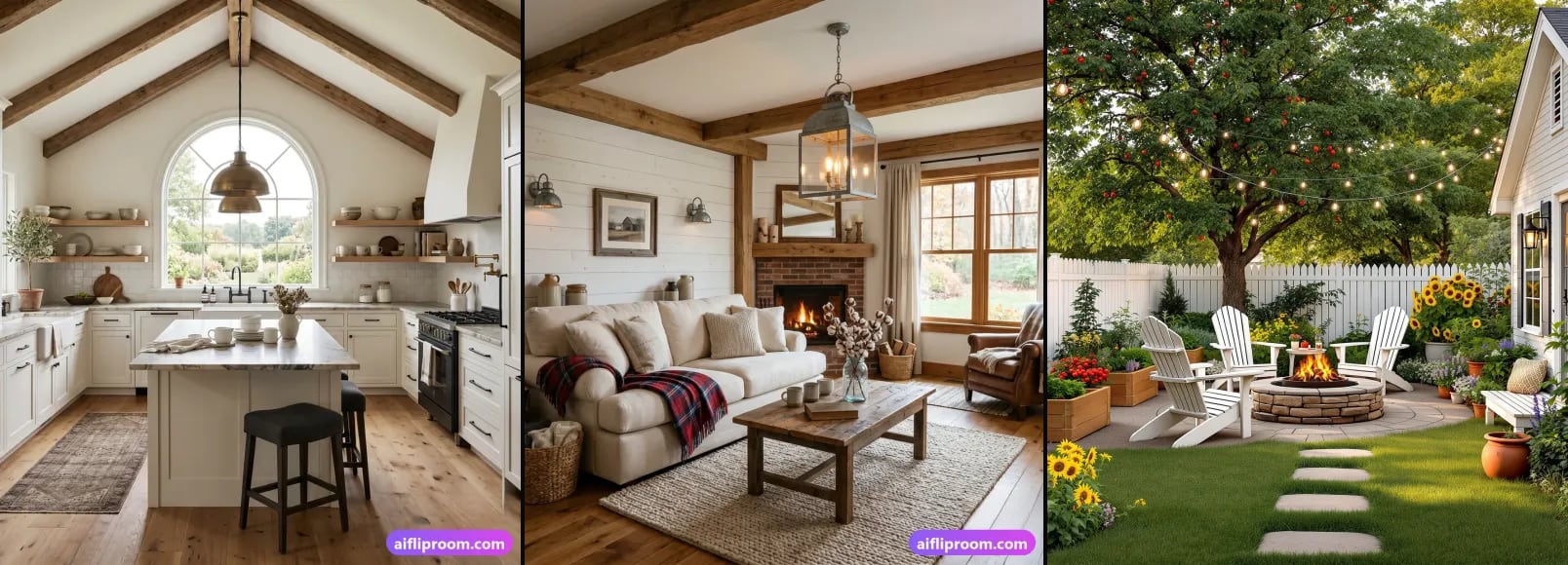
Modern Farmhouse Interior Design: Elements, Rooms, Mistakes
Modern farmhouse explained: six ingredients, a typical palette, its place between rustic and contemporary, room by room, and the mistakes that date it.