Retrofuturism Interior Design
Space Age 70s — curved pod furniture, chrome, burnt orange, Kubrick mood.
Stage your room in Retrofuturism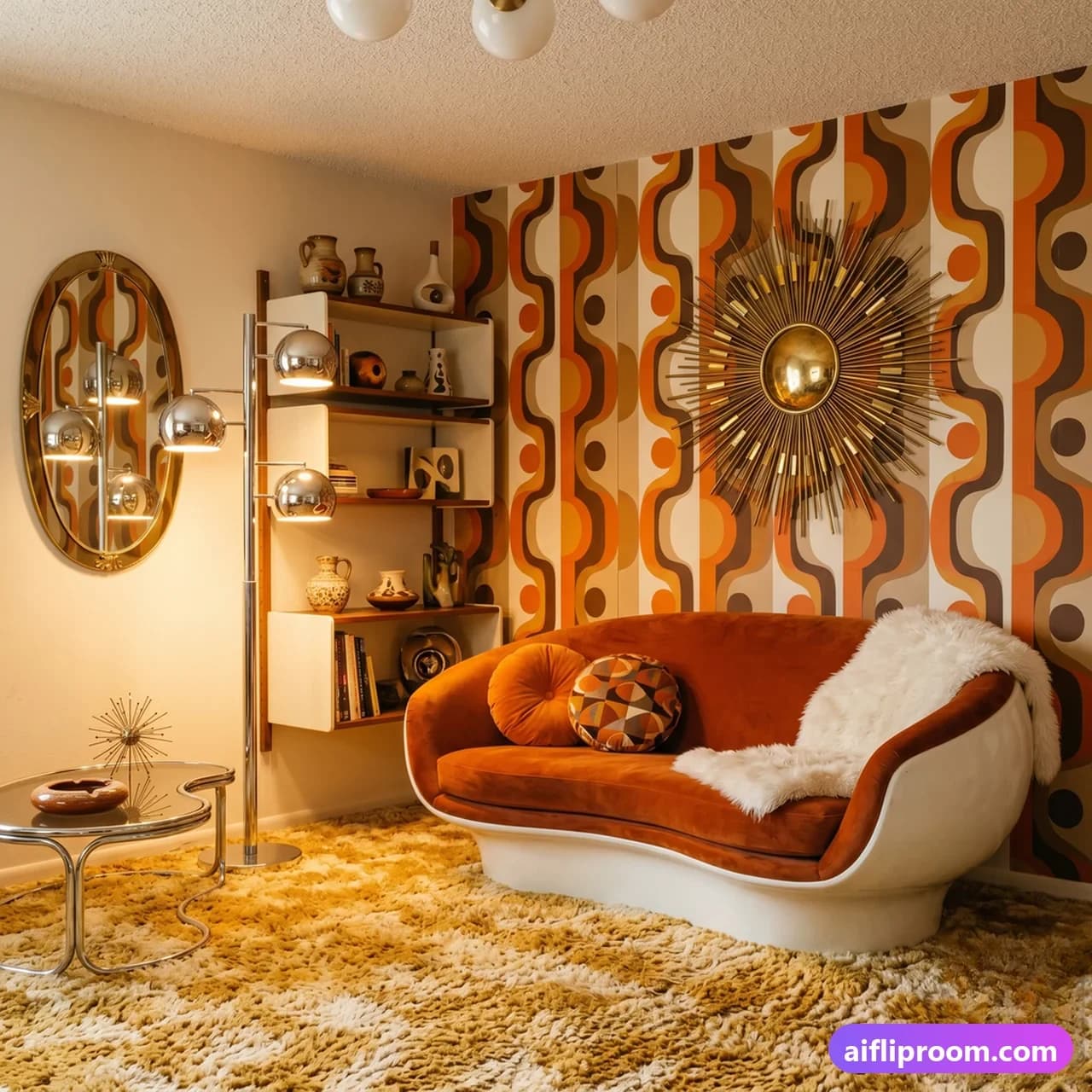
What is Retrofuturism interior design?
Retrofuturism revisits how the 1960s and 70s imagined the future — an optimistic, space-age vision full of curves, gloss and confidence. As an interior style it is bold and fun. Furniture is pod-like and sculptural, with rounded shapes and low, enveloping forms; chrome and glossy finishes catch the light; and the palette pairs warm neutrals with statement colours like burnt orange. Lighting is a centrepiece — sculptural, almost like a prop from a film set — and textures such as shag add tactile warmth. The look is unapologetically a look: it commits. The result is a room with a strong, playful point of view. In staging, retrofuturism is a distinctive choice for buyers who want personality and design confidence rather than a neutral backdrop, and it gives statement living rooms a memorable identity.
Where Retrofuturism comes from
Retrofuturism is the future as it was imagined between roughly 1960 and 1980 — the space-age optimism of the Apollo era, translated into furniture. Designers had new plastics, fibreglass and moulded foam to work with and used them to make shapes that had never been possible: egg and ball chairs, pod seating, tulip bases, modular seating systems that could be rearranged like building blocks. Colour went saturated because the new materials could hold it. Then oil prices rose, plastic got expensive and unfashionable, and the whole direction stopped almost overnight. What survives is a style that feels simultaneously nostalgic and futuristic, which is exactly the appeal — it is a future that never arrived, and we know how it ends.
Key elements of Retrofuturism
- Pod-like, sculptural furniture
- Chrome and glossy finishes
- A palette of warm neutrals with burnt orange
- Sculptural, space-age lighting
- Shag and other tactile textures
- A confident, optimistic retro mood
When to use Retrofuturism
Living rooms and statement spaces. A bold, fun look for buyers who want personality and a strong design point of view.
Retrofuturism colours and materials
Loud and confident. Orange, mustard, avocado and olive green, brown and cream — the authentic 1970s set — with white, chrome and black as the structural neutrals. Later variants add a cooler space-age palette of white, silver and one primary. Materials are moulded plastic and fibreglass, chrome and polished steel, smoked glass and acrylic, shag pile, corduroy, vinyl and bold geometric or op-art fabric. Wood, where it appears, is dark and glossy. Nothing is matt, nothing is rustic, and nothing is subtle; the style is about surface and shape rather than about texture.
Retrofuturism room by room
Living room in Retrofuturism
A modular sofa in a single strong colour, arranged as a low block rather than around the walls, or a pair of pod or egg chairs if the room can carry them. A tulip-base or smoked-glass coffee table, a shag rug, and an arco-style arched floor lamp or a chrome globe pendant. Keep the wall colour plain — white, cream or one saturated block — and let the furniture shapes be the event. A conversation-pit arrangement, with seating low and facing inward, is the most authentic layout the style has.
Bedroom in Retrofuturism
A low platform bed, ideally with a rounded or integrated headboard, bedding in white or one strong colour, and a chrome or moulded plastic bedside unit. A shag or high-pile rug, a globe or mushroom lamp, and a large round mirror. Geometric or op-art print on one wall or in the bedding, not both. Built-in or wall-mounted storage keeps the floor clear, which is what makes the low furniture read as deliberate.
Dining area in Retrofuturism
A tulip table with moulded shell chairs in a single colour, or a smoked-glass top on a chrome base. A dome or globe pendant hung low. Coloured glassware and ceramics in orange, brown and olive. This is the easiest room in which to do the style convincingly, because the furniture archetypes are widely reproduced and genuinely comfortable.
Home bar or lounge corner in Retrofuturism
The style's natural home. A curved banquette or a pair of low swivel chairs, a chrome and smoked-glass trolley, coloured glassware, and a globe lamp. A round rug and a piece of op-art on the wall. It occupies almost no space and delivers more of the aesthetic than a whole room of restrained versions would.
Bathroom in Retrofuturism
Bold tile in a single saturated colour or a geometric pattern, chrome fittings, a round mirror with integrated lighting, and a moulded basin. This is one of the few styles where a coloured suite is correct rather than a mistake. Keep it to one strong colour plus white, and let the shapes — round, capsule, curved — do the rest.
Retrofuturism mistakes to avoid
- Treating it as a costume. Buying a room's worth of period reproduction at once produces a set. One or two genuine shapes against plain surroundings is far more convincing.
- Too many colours. One or two saturated tones against white, cream or chrome. Orange, avocado, mustard and brown all at full strength in one room is where the seventies got its reputation.
- Ignoring the shapes. The style is defined by form — pod, egg, tulip, globe, capsule — rather than by colour. A brown and orange room with square furniture is not retrofuturist.
- Cheap plastic. The originals were properly moulded fibreglass and ABS. Thin, flexing imitations look wrong and do not last.
- Applying it to a whole house. It is intense. One room, or one corner, keeps it fun rather than relentless.
Retrofuturism questions, answered
What is retrofuturism in interior design?
A style based on how the future was imagined roughly between 1960 and 1980: moulded plastic pod and egg chairs, tulip bases, modular seating, chrome and smoked glass, globe lighting and saturated space-age colour. It is nostalgic and futuristic at once, because it reproduces a version of the future that never arrived.
What is the difference between retrofuturism and mid-century modern?
Mid-century modern is earlier and warmer — teak and walnut, tapered legs, organic curves, earthy accent colours, natural materials. Retrofuturism is later and synthetic — moulded plastic and fibreglass, chrome, high-gloss surfaces, saturated colour and space-age shapes. Mid-century looks like a well-made home; retrofuturism looks like a set from a film about 2001.
Is retrofuturism practical to live with?
In moderation. The seating is often genuinely comfortable, and the modular systems are useful. What is impractical is the full commitment — high-gloss surfaces show every mark, shag pile is difficult to clean, and saturated colour is tiring across a whole home. One room done fully works better than a house done partially.
What colours define the style?
Orange, mustard, avocado and olive, brown and cream, against white, chrome and black. A cooler space-age variant uses white and silver with a single primary accent. Either way the colours are saturated rather than muted, and there are only ever one or two of them dominating.
Is retrofuturism suitable for staging a property?
Not for a general listing — it is a strong personal taste and it narrows the buyer pool considerably. It can work for a period apartment of the era or a property being marketed on character, and a single retro piece in an otherwise neutral room gives listing photographs personality without committing the whole house.
Guides to read next
Longer reads on getting a room photographed and restaged well.
- See Your Own Room in a New Style Before You Buy AnythingPreview your actual room in a new style before buying furniture or hiring anyone: what a preview settles, what it can't, and five steps to a useful one.
- How to Photograph Rooms for Virtual Staging: 7 RulesDaylight, lamps off, a level phone at chest height, the 1x lens not 0.5x, one room per frame, clear surfaces — seven habits that make AI staging look real.
- What Is Virtual Staging? The Complete Guide: How It Works, Cost, Rules, ExamplesVirtual staging explained in plain language: how AI furnishes a photo of a real room, what it costs, what agents think of it (NAR 2025), who it helps, the rules and how to spot bad staging.
See your room in Retrofuturism
Upload a photo and our AI restages it in the Retrofuturism look in 15–60 seconds, depending on how much detail your room has — keeping your walls, windows and layout intact.
Try Retrofuturism on your room