Modern Farmhouse Interior Design: Elements, Rooms, Mistakes
AI Flip Room · 9 min read
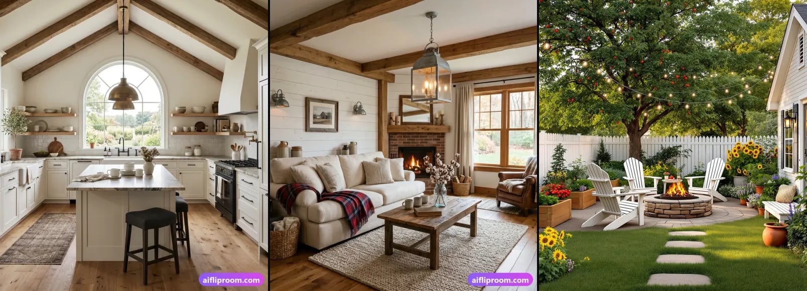
Modern farmhouse is one of those looks that feels instantly familiar yet hard to pin down. Everyone recognises it — the white kitchen, the black tap, the timber beam — but why it works is subtler than any single element. At its heart, modern farmhouse interior design is a conversation between two opposites: the warmth and imperfection of old rural houses, and the clean, uncluttered restraint of contemporary design. Get that balance right and a room feels lived-in but calm, rustic but never fussy.
This guide breaks the style into its six real ingredients, shows a typical palette, places it on the line between rustic and contemporary, walks through it room by room, and flags the mistakes that tip a space from "cosy" into "theme park". Whether you are decorating your own home or staging a listing, the principles are the same.
What is modern farmhouse style?
Modern farmhouse is traditional farmhouse decorating with the clutter edited out. It keeps the honest ingredients — shaker doors, panelled walls, a deep sink, visible timber — and lightens the palette to warm white, sharpens the details with matte black and simplifies the furniture. The contrast is what makes it modern; the materials are what keep it farmhouse.
The traditional farmhouse was practical architecture: a big working kitchen, durable materials, a deep porch, furniture built to last. The "modern" half strips away the floral wallpaper, the collected clutter and the country kitsch, and replaces them with simpler silhouettes, cleaner lines and a restrained palette.
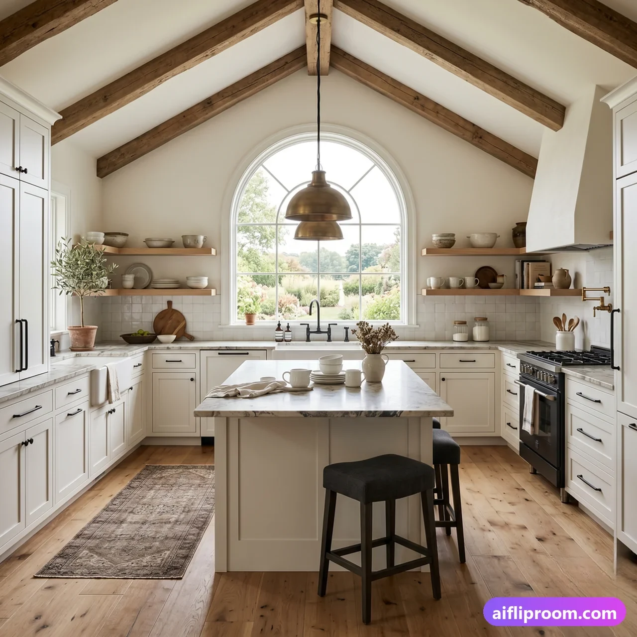
So this is not a pile of barn décor — it is a discipline. You keep the honesty of natural materials and the warmth of a working home, then edit hard. Think of it as rustic soul with a minimalist's self-control. The kitchen at the top of this page is the whole idea in one frame: white shaker cabinets, black pulls, oak underfoot, two brass pendants, and a pair of timber beams that remember where the style came from.
What are the six ingredients?
Panelled walls, black hardware, warm neutrals, natural wood with visible grain, clean-lined furniture and a few handmade objects. Six things, and you do not need all six in every room — using every one at once is the most common way to overdo it. Two or three, done well, read as modern farmhouse; all six read as a showroom.
Which colours and materials?
White and black with warm wood between them. Warm white or greige on the walls; black on taps, pulls, frames and lights; natural oak or a mid-toned timber on floors, beams and shelving. Secondary colours are few and muted — sage, dusty blue, warm grey. Pattern is almost absent, which is the clearest difference from traditional farmhouse.
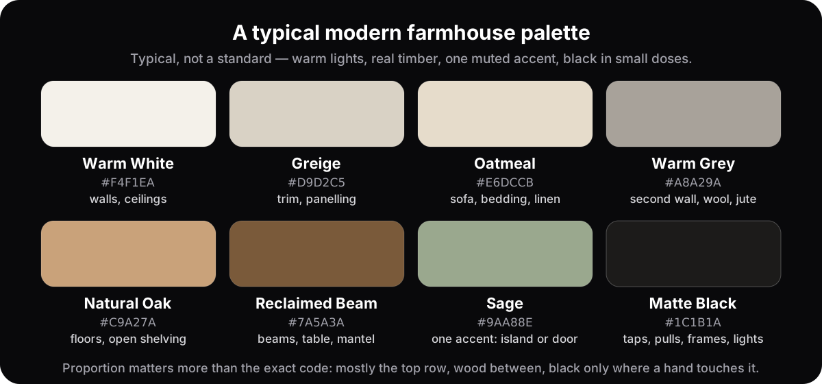
The restraint is intentional. Because the palette is quiet, the eye reads the materials instead: the grain of the wood, the weave of a throw, matte black against chalky white. If a room feels flat, add texture before you add colour — a jute rug, a chunky knit, a linen slipcover, a timber tray.
Materials follow the same logic. Shaker joinery, shiplap or board-and-batten panelling, butcher block and quartz, plain white tile, matt black metal, jute and wool, cotton and linen in plain weaves or a simple stripe. Nothing glossy, nothing printed with a slogan, nothing pretending to be a material it is not.
If you love the calm-neutral idea but want it cooler and more pared back, compare it with its Nordic cousin in our Scandinavian interior design guide — or put the two side by side in one room: a Scandinavian kitchen uses the same white walls and pale timber but swaps the black hardware and the beams for lighter, cooler contrast. Japandi is the third cousin, quieter than either. All three share a love of natural materials and diverge sharply on warmth and contrast.
Where does it sit between rustic and contemporary?
Third stop from the left on a line that runs from rustic through farmhouse to contemporary. Each step edits more of the farm out: rustic keeps everything raw, farmhouse paints and tidies it, modern farmhouse strips the pattern and sharpens the contrast, contemporary removes the last beam. Knowing your place on the line stops you sliding off either end.
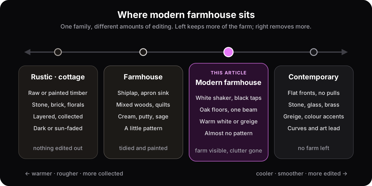
The line is useful in practice. If a room feels heavy and dark, you have drifted left towards rustic: take out a wood tone, paint the panelling, lighten the textiles. If it feels flat and could be any new-build show home, you have drifted right towards contemporary: bring back one beam, one piece with visible age, one basket. Modern farmhouse is the point where the farm is still visible but the clutter is gone.
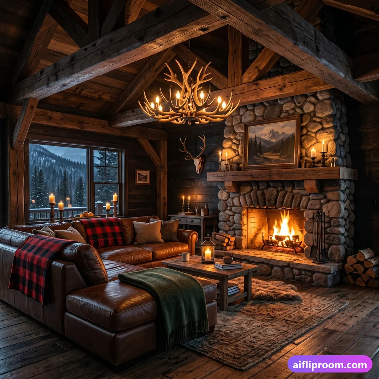
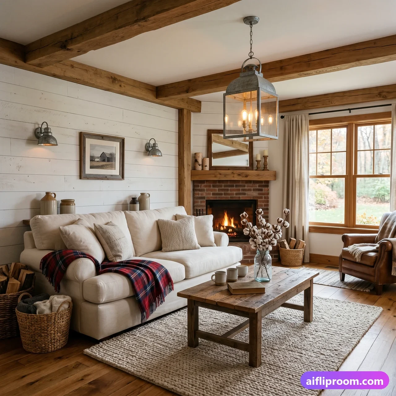
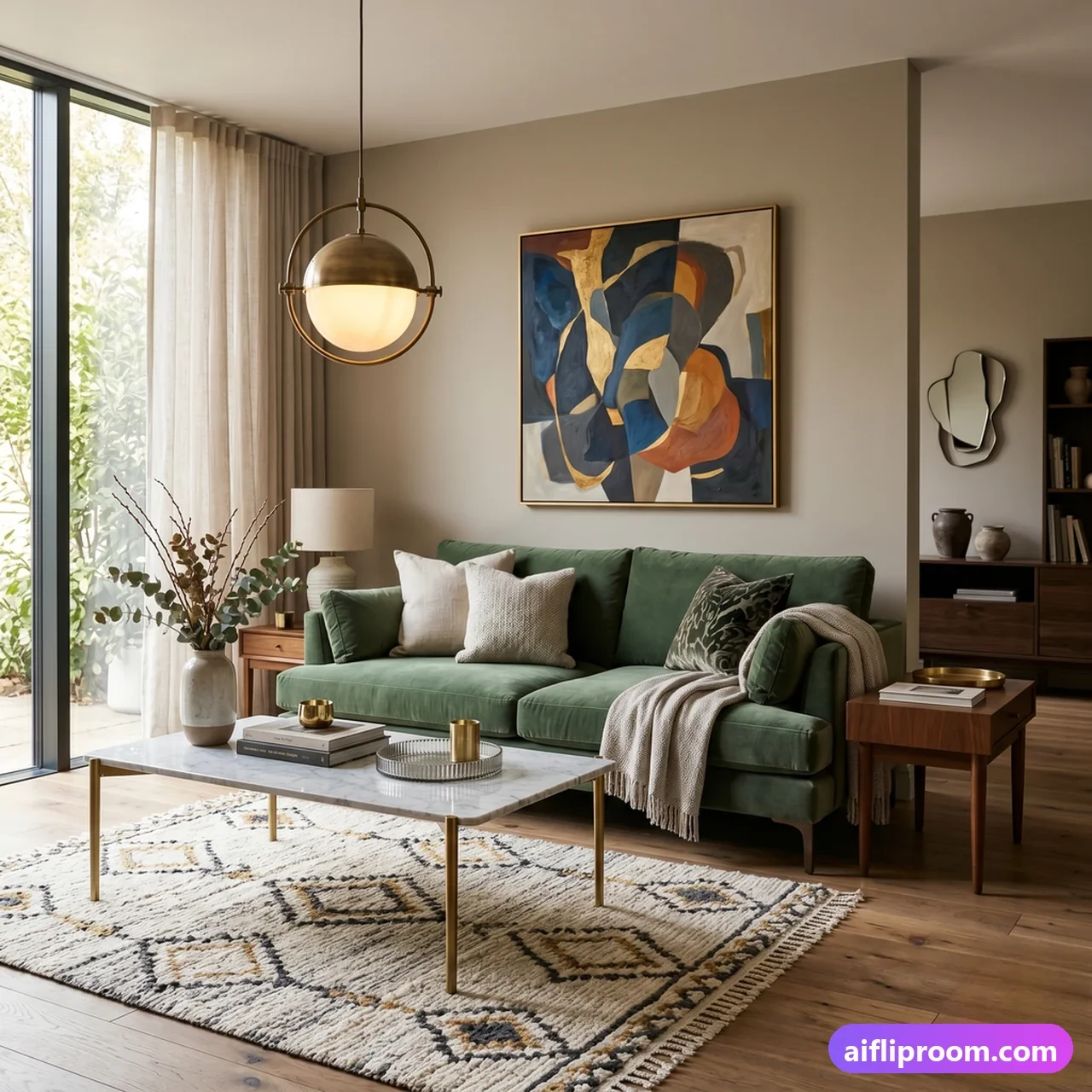
Here are the four stops as our style library renders them — four different rooms, one per style, so the differences are easy to see.
How does it change room by room?
The ingredients stay the same; the dose changes. The kitchen takes the full recipe — it is the room the style was built around. The living room takes panelling, timber and texture. The bedroom takes the softest, calmest version. Bathrooms and entries take a concentrated hit of black and white — the cheapest rooms to get exactly right.
Kitchen
The kitchen is this style's home turf, and the image at the top of this page is a textbook one. The signature moves: a deep apron-front sink, white or two-tone shaker cabinets, a butcher-block or quartz worktop, black or aged-brass hardware, and two or three pendants over the island. Open oak shelving holds a few pieces of plain white crockery. Keep the counters nearly clear — this version of farmhouse shows clutter more than the traditional one does, and the uncluttered surface is what makes it read "modern" rather than "grandma's kitchen".
Living room
Anchor the room with a deep, clean-lined sofa in white, oatmeal or grey — washable covers if there are children or dogs — then add the rustic contrast: a timber coffee table, a jute or wool rug, a leather chair, a throw or two. Shiplap or board-and-batten on the fireplace wall, with a timber mantel and a black metal surround, gives the room its focal point. Keep the art simple and large: one oversized piece rather than a gallery wall, and a few well-chosen objects with breathing room.
Bedroom
Bedrooms are where the style is at its softest. A simple timber or upholstered bed, white or oatmeal bedding with one textured layer, matching oak nightstands with black hardware, and one statement: a black iron light, a bench with some age at the foot of the bed. Board-and-batten behind the bed if you want panelling anywhere. Layer the same neutral family in different textures for a hotel-calm feel, keep pattern to a minimum, and let the linen wrinkle a little.
Bathroom and entry
Small spaces take a concentrated dose of the style well. In a bathroom: white subway or hexagon tile, a timber vanity with a stone top, black taps against a white basin, a black-framed mirror, a wooden stool and a basket for towels. In the entry or mudroom — almost a signature of the style — a built-in bench with cubbies above and shoes below, painted white with a row of black hooks, and board-and-batten to shoulder height. Both are low-cost, high-impact rooms to test the look before committing to a whole house.
What are the mistakes that make it look dated?
Decorative signs, cool grey as the neutral, shiplap on every wall, black on everything, faux materials and no texture. Each is a sign the theme was bought instead of the style. The version that dates a room fastest is the heavily themed late-2010s one; the underlying specification — white shaker, black hardware, warm oak, simple lines — has not aged.
| Do | Don't |
|---|---|
| One panelled wall — the fireplace wall, or behind the bed | Shiplap in every room until it becomes wallpaper |
| Warm white or greige on the walls | Cool blue-grey — the previous decade's version of the style |
| Black on taps, pulls, frames and lights | Black furniture, black worktops and black walls as well |
| One honest timber element per room: a beam, a table, the floor | Plastic "barn wood", vinyl-wrap shiplap, beams that fool no one |
| Two or three handmade objects with air around them | A shelf of matching décor and a wall of typography |
| Jute, wool, linen and visible grain to stop a white room going flat | A neutral palette with no texture at all |
| Mix wood tones and eras a little | A boxed bedroom or living-room set bought in one go |
The all-rustic trap deserves its own line. If everything is distressed, weathered and antique, you have built a country cottage, not a modern farmhouse; it is the clean-lined, contemporary pieces that earn the "modern", and you need both voices in the room. The opposite trap is just as real: strip out the last beam and the last basket and you have a white kitchen that could be anywhere.
How do you see it in your own room before committing?
Upload a photo of the room and restage it. Cabinets, hardware and panelling are expensive to undo, so it pays to look before you spend. AI Flip Room, our tool, keeps your real walls, windows, ceiling and camera angle and changes only the furnishings and finishes, in 15–60 seconds depending on how much detail the room has.
Start with the dedicated modern farmhouse style on the generate page to see the black-and-white-and-oak version applied to your kitchen or living room, then run the same photo through the warmer farmhouse style and compare. That comparison — the same room, one step to the left on the spectrum — is the fastest way to find out which side of the line you actually like. Every account starts with three free renders and no card, which is exactly enough to try both and a cooler third.
Two things make the result better. The input photo matters as much as the style — a level, daylit, decluttered shot restages far more cleanly, and how to photograph rooms for virtual staging covers the handful of habits involved. And look at the result on your phone while standing in the room; seeing your own room before you buy anything explains why that single step matters more than any number of inspiration photos. Finished before-and-after examples show the level of realism to expect, and the pricing page covers volumes if you are working through a whole house.
Does it work for staging a listing?
Yes — it is one of the strongest choices for suburban and rural family homes: widely liked, crisp in photographs, and it reads as well kept. Keep it honest. For a listing, change only the furniture and décor — walls, windows, cabinets, floors and fixtures stay as photographed — and label the image as virtually staged.
The wording of the rule differs by market, and it is not an obstacle: buyers understand a clearly labelled visualisation perfectly well. Our virtual staging disclosure guide explains the principle and quotes the rules for the jurisdictions we have read in full. The cabinet-colour and panelling experiments above are for owners planning a renovation; in a listing photo the kitchen stays the kitchen it is.
Done well, modern farmhouse is less about barn doors and more about balance: warmth held in check by restraint, character held in check by clean lines. Nail that tension and the look stays current for years — not a trend you will be redoing next season.
Questions people ask about modern farmhouse
What is the difference between farmhouse and modern farmhouse?+
Traditional farmhouse is warmer, more layered and more antique: mixed woods, patterned textiles, collected furniture, softer contrast. Modern farmhouse keeps the same ingredients and simplifies them — crisper white walls, sharper black accents, cleaner lines, almost no pattern. A quick test: modern farmhouse looks newly renovated, traditional farmhouse looks lived in for decades. On the spectrum above they are neighbours, one editing step apart.
Is modern farmhouse out of style?+
The heavily themed version is — decorative signs, distressed everything and cool grey neutrals all date a room to the late 2010s. The core specification is not: white shaker kitchens, black hardware, warm oak and simple lines remain a renovation staple. The current direction is warmer, plainer and less literal about the farm, which is the version this guide describes.
Can modern farmhouse work in a city apartment or a new build?+
In a restrained form, yes. Keep the warm white walls, the black hardware, the oak and the clean-lined furniture, and drop the barn door, the shiplap and the beams, which need architecture to justify them. What you end up with reads as warm and unpretentious rather than rural. If the building is very modern, a step to the right on the spectrum — towards contemporary — usually fits it better than forcing the farm in.
What is board-and-batten, and is it better than shiplap?+
Board-and-batten is a wall treatment of wide flat boards with narrow vertical strips covering the joins, painted one colour and usually run to shoulder or three-quarter height. Shiplap is horizontal planks with a small shadow gap. Neither is better; they read differently. Board-and-batten is crisper and suits bedrooms, entries and stairwells; shiplap is softer and suits a fireplace wall. Either way, one wall or one room — not the whole house.
See it on your own room
Upload a photo and watch AI restage your space in 15–60 seconds, depending on how much detail it has — free to try, no credit card.
Try AI Flip Room freeGot a question about this?
Something unclear or not covered? Ask here. We read every question and answer the useful ones right in the article. Nothing you write is published.
Related reading
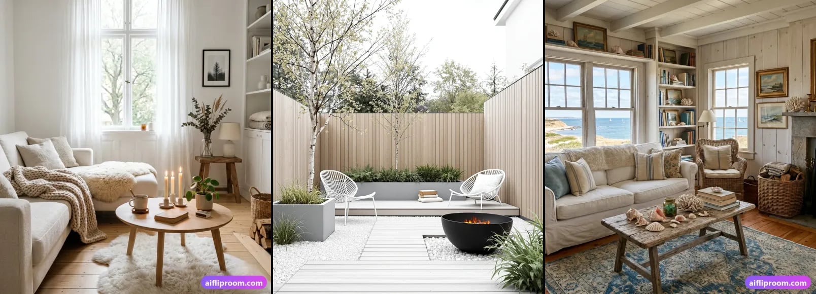
Scandinavian Interior Design Guide: Palette, Wood, Rooms
What defines Scandinavian interior design: the typical palette and woods, how it differs from Japandi and minimalism, room-by-room notes, common mistakes.
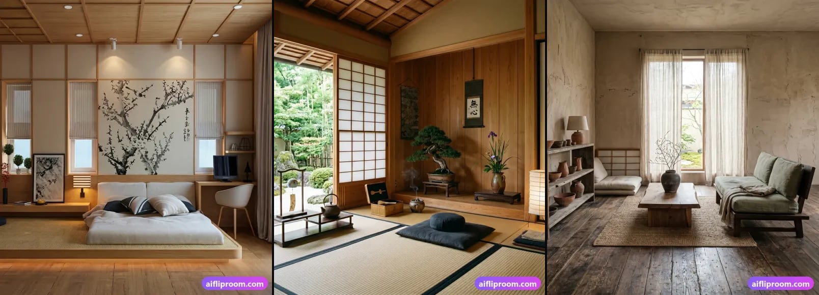
Japandi Style Guide: Palette, Materials, Furniture, Rooms
What Japandi is, the palette and materials that make it read as real, the furniture that works, how it changes room by room, and the mistakes to avoid.
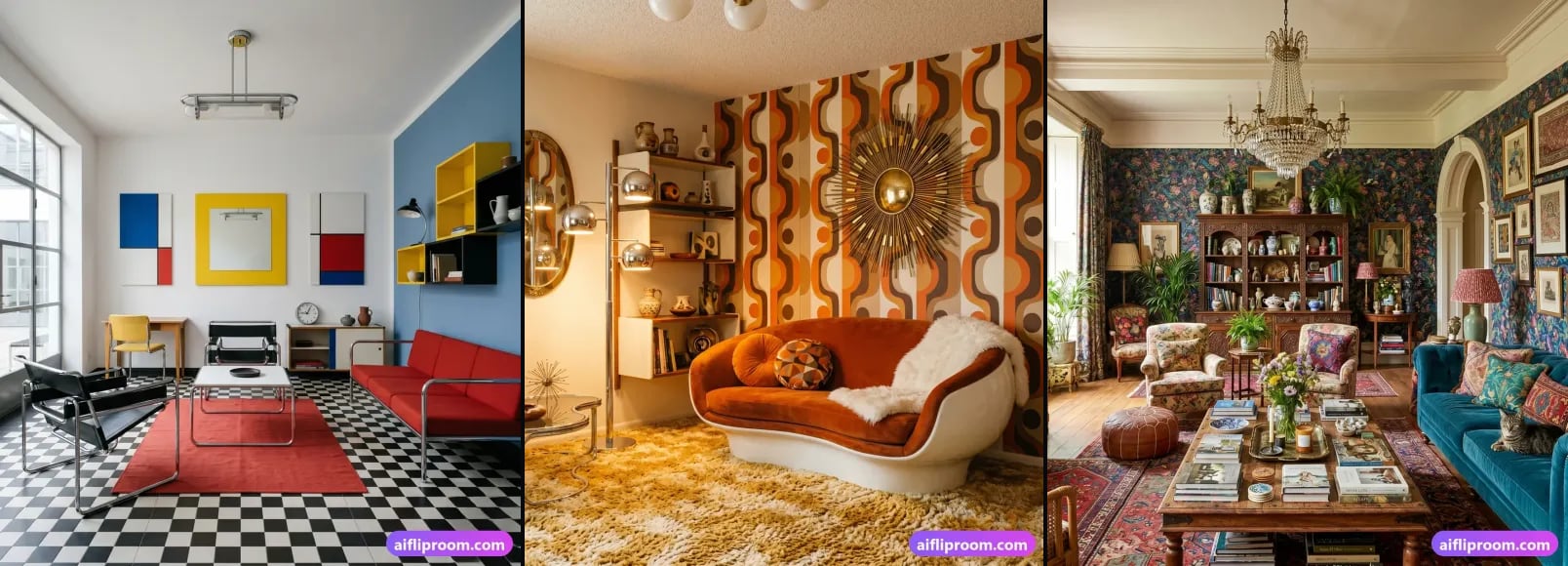
See Your Own Room in a New Style Before You Buy Anything
Preview your actual room in a new style before buying furniture or hiring anyone: what a preview settles, what it can't, and five steps to a useful one.